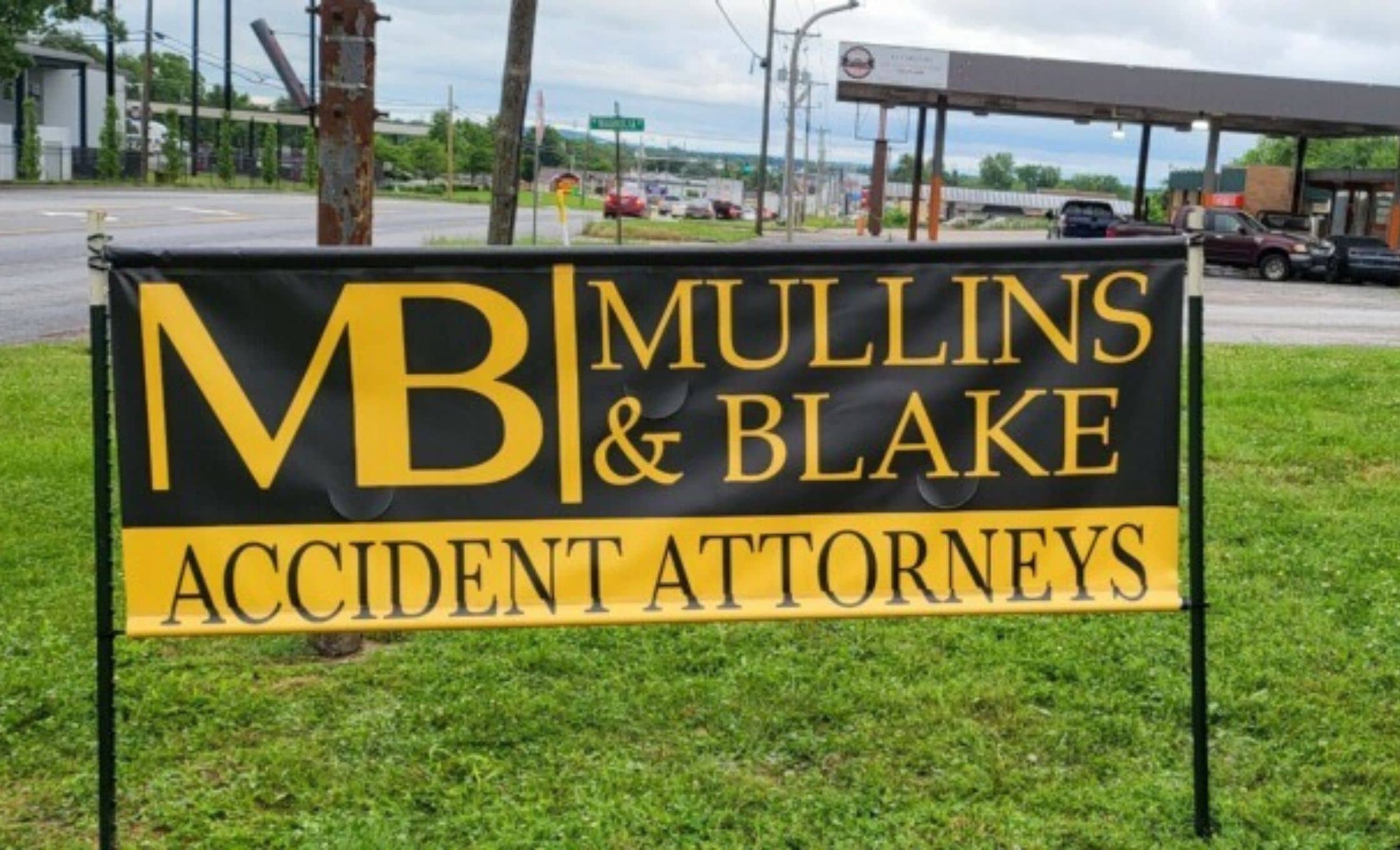
Tips for Designing Successful Business Signs
Designing the perfect sign for your business is more important than you might think.
It helps people form a first impression of your business– letting them know at a glance where you’re located and what you’re all about.
While the main purpose of a sign is to help people locate your business, there’s a little bit more that goes into it. Allow us to explain…
Think of it as free advertising
Of course, purchasing a sign for your business costs money– but once that investment has been made, that sign stands in the same spot for 24 hours a day, 365 days a year, in all kinds of weather, representing your business.
There’s simply no other form of promotion that’s so consistent and visible. Placing an ad in a magazine, or on a bus, will allow for a lot of visibility, but a business sign exists in the same location as your business.
That means an effective design can influence people to stop in to check out your products or services– while seeing an advertisement somewhere else might make them want to stop by sometime later. Who knows if that’ll actually happen?
Make it legible
If people can’t read your sign in the split second they’re likely to spend looking at it, your sign isn’t doing its job.
It’s extremely important to carefully curate what information you’d like to include on the sign. While it might seem important to include your business’s name and slogan and phone number and email address and website, that’s way too much information for people to absorb in a short period of time.
Of course, there are no hard-and-fast rules when it comes to sign design. There’s no formula for the perfect sign. It all depends on context, size, industry, and essentially, a million other factors.
It’s a good tip, however, to consider what information is the absolute most important– what do you really need to communicate to the customer?
Usually, this information just includes your business’ name and logo– and maybe one piece of contact information, like your website.
However, the less information that’s present on your sign, the less visual clutter people need to sort through in order to get the message. Less visual clutter and the ability to get the point as quickly as possible equals a sign that’s doing its job.

Do the Math
Have you ever noticed how large corporate chain restaurants and stores have extremely consistent signs that allow you to recognize them no matter where you are?
No matter where you are, you’re able to spot a Target or a McDonald’s instantly because of how well they’ve established a brand identity.
These corporations also adhere to a brand guide that includes details that might seem fussy at first glance– for example, determining sign size based on the sign’s distance from the road, and even the speed limit on the nearest road.
A sign located next to a busy highway with a speed limit of 70 mph will need a much larger and simpler sign than one that’s located on a tiny side street with a speed limit of 25 mph.
While you most likely don’t need to come up with an equation to determine your sign’s size, it is helpful to consider where the sign will be located in order to come up with the perfect size and design.
Leave it to the pros
There are many other factors that go into the design of a perfect business sign– like choosing a typeface that works for your brand and is easily legible, or choosing a color scheme with enough contrast to let people read it at a glance even if they’re passing by quickly.
At Wrapology, we’ve done it all before. If you’re on the hunt for a business sign that’s perfect for you, look no further– just give us a call today to get started.
