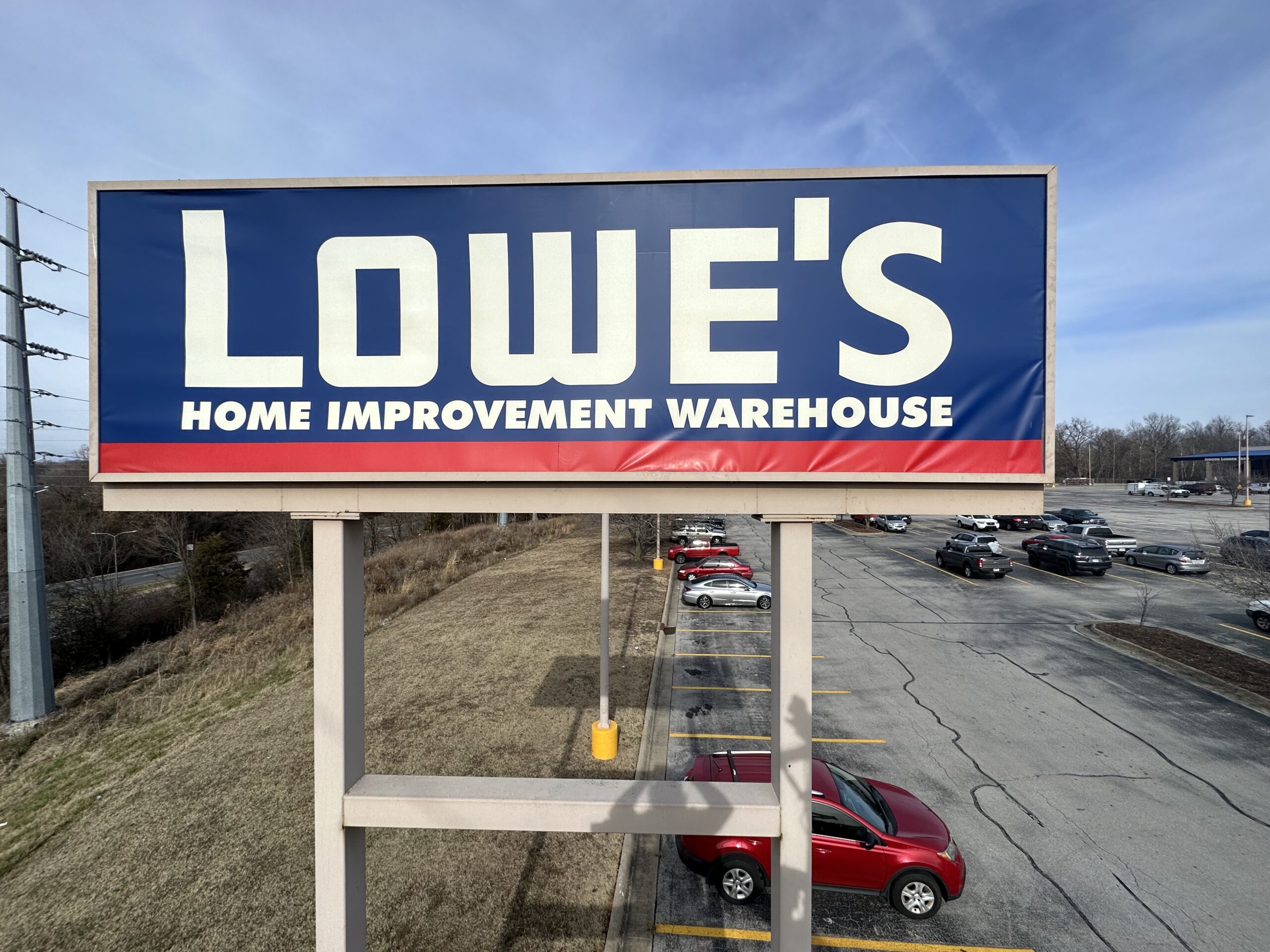
When it comes to business signage, design often takes center stage. But one of the most powerful tools in visual communication isn’t just the font or layout, it’s color. The right color palette can influence perception, evoke emotions, and even drive purchasing decisions. For businesses aiming to create impactful custom business signs, understanding color psychology can make the difference between blending in and standing out.
How the Psychology of Color Shapes Customer Perception
Color is more than decoration; it’s a silent communicator. Studies show that people make subconscious judgments about a product or brand within seconds of seeing it—and up to 90% of that judgment can be based on color alone. That’s why professional sign design considers not just aesthetics, but emotional influence.
For example, red conveys urgency, excitement, and passion. It’s why you often see it used in sales or restaurant signage. Blue, on the other hand, communicates trust, stability, and calmness, qualities that make it a favorite for banks, tech firms, and healthcare providers. Green evokes growth and freshness, making it ideal for eco-friendly brands or businesses tied to nature.
By applying the psychology of color to your business signage, you can design visuals that connect emotionally and stand out in a crowded market.
Building Trust and Recognition Through Consistency
Consistency in color builds brand recognition. Think of some of the world’s most recognizable logos—each one uses color as a defining element. When a business uses the same shades across storefront signage, vehicle wraps, and interior graphics, it creates a sense of trust and professionalism.
At Wrapology, the goal isn’t just to produce eye-catching signs but to make sure those signs communicate your identity clearly and consistently. A color palette that’s strategically chosen and applied across multiple platforms helps reinforce who you are and what you stand for, every time someone sees your brand.
Emotional Impact: Matching Colors to Your Message
To choose the right colors for your signage, think about the emotional response you want your customers to have when they see your brand. Here’s how certain colors tend to influence people’s feelings and behaviors:
- Red – Passionate, energetic, and attention-grabbing. Great for promotions or to encourage quick decisions.
- Blue – Trustworthy, secure, and professional. Works well for corporate and medical industries.
- Green – Natural, balanced, and refreshing. Ideal for wellness or environmentally focused businesses.
- Yellow – Cheerful and optimistic. Perfect for drawing attention to deals or welcoming signage.
- Black and White – Classic and minimal. Creates a sense of luxury and sophistication when paired correctly.
When these principles are applied to outdoor signs, the effect is even stronger. Outdoor signage competes with countless other visual distractions, so your colors need to do more than look good—they need to capture attention quickly and convey the right emotion instantly.
Climate and Material Considerations
Choosing colors isn’t just about psychology, it’s also about performance. Certain colors and finishes react differently to weather and sunlight, which can affect longevity and appearance. This is where having a local sign company with a climate-controlled facility makes a real difference.
In Arkansas, for example, heat and humidity can cause fading or bubbling in lower-quality wraps and signs. That’s why Wrapology uses weather-resistant car wrap materials and fade-resistant inks to preserve color vibrancy. Properly protected colors ensure your brand message stays bright and consistent—no matter the weather.
The Role of Color in Modern Brand Identity
As digital marketing grows, physical signage still plays a vital role in reinforcing brand presence. A well-designed sign that leverages the psychology of color helps your brand make a lasting impression. The most effective signs are those that not only look professional but also communicate personality through color.
When customers see consistent, emotionally resonant colors in your commercial signage, they’re more likely to remember your business, trust your brand, and engage with your products or services.
Bringing It All Together
Color is one of the simplest yet most powerful tools in branding. It influences mood, behavior, and perception, all in an instant. By understanding the psychology of color and pairing it with professional design, high-quality materials, and controlled production, your signage becomes more than just a label, it becomes an experience.
Whether you’re refreshing your storefront or wrapping a fleet of vehicles, the right color choices will help you connect with your audience and strengthen your brand identity. Wrapology’s team specializes in crafting signage that doesn’t just catch the eye, it captures emotion.
Bring your brand to life through color that works as hard as you do. Visit us at 4707 E Mission Blvd, Fayetteville, AR 72703, or reach out to us here.

