Maximizing the Impact of Your Business Signage
There are countless marketing strategies in the world– so many that it’s hard to know exactly how to go about marketing your unique business. However, there’s one underrated champion of marketing that has the potential to grab attention, leave a lasting impression, and drive customers straight to your doorstep– your business signage!
A sign essentially acts as a magnetic force, drawing people in and compelling them to explore the products and services your brand has to offer them. If you’re curious about maximizing the impact of your business signage, and making sure that it stands out in its location, then you’re in the right place.
Catch their eyes, capture their attention
The visual design of your business signage plays a major role in catching the attention of potential customers, making a lasting impression on them.
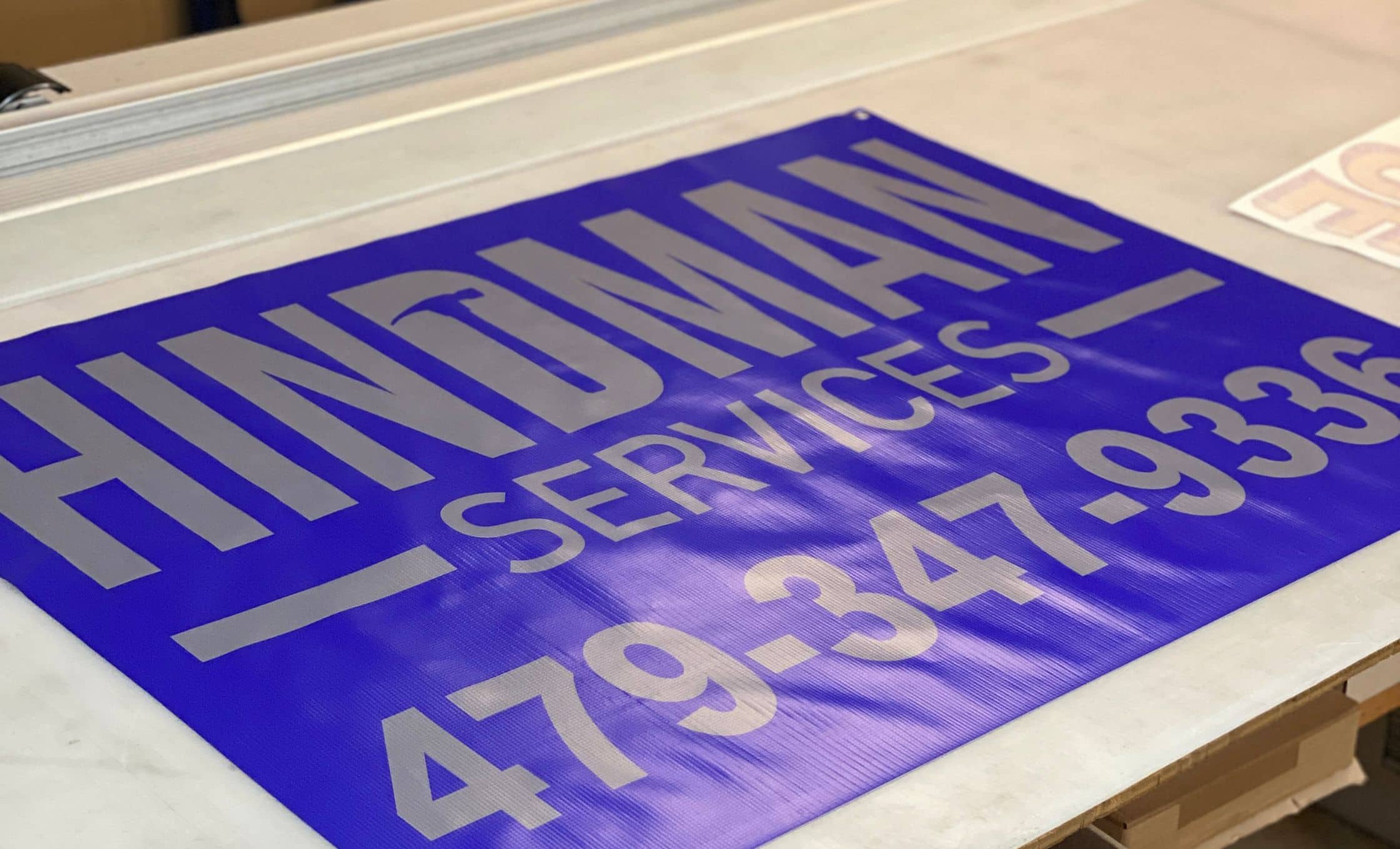
When designing your signage, you should make sure to utilize bold colors with adequate contrast, and easily-readable fonts, to allow customers to read them even from a distance. If you’re incorporating imagery into your design, use high-resolution images when possible. Bold colors and legible text will help your sign stand out even in a sea of other signage.

Keep it clear
Pleasing aesthetics aren’t quite enough to guarantee that a sign is successful. It’s also important to make sure that the sign conveys your brand’s message as clearly and succinctly as possible. Keep the text simple and legible, allowing passersby to grasp the message at a quick glance.
Iconography can also be helpful with communicating meaning. Consider the symbols we see during our daily lives– restroom signage is a great example of this.
Everyone knows what the restroom symbols mean at a quick glance, without needing to read any text.
Depending on your business, you might be able to incorporate iconography into your signage as well.
A mechanic might choose to include simple icons of tools in their sign design, or a coffee shop might choose to include a mug. This can be visually interesting when handled correctly, and it can eliminate any confusion about what your business is offering.
Consistency is key
Your signage should always be consistently aligned with your existing branding and imagery– incorporating your logo, brand colors, and typography.
Staying consistent across all platforms and marketing channels makes a huge difference in reinforcing brand recognition.

SEO matters
One thing about signage that you might not realize– it can actually have an impact on your business’s search engine optimization!
Local SEO requires clear and consistent NAP information– which means making sure that your business name, address, and phone number are accurate, consistent, and clearly visible across all online directories and on your signage.
This consistency helps search engines validate your business information, improving your local SEO rankings (which means that when people search “[business] near me”, yours will pop up!)
Strategic placement
The location where you install your sign is just as important as the design of your sign itself. You should carefully consider where you’d like your sign to exist, and develop a placement strategy based on a few different factors.
First, it’s important to make sure that your sign is placed in a high-traffic area. Is there a busy intersection directly adjacent to your business? It makes sense to place your sign in a highly visible spot from that intersection.
Additionally, consider local competitors and place your signage accordingly. If there’s a competitor in direct proximity, making your sign more visible can help customers compare their options– in your favor!
Consult a professional
If you’re overwhelmed by all of the above suggestions, don’t worry– you don’t have to develop all of the skills of a graphic designer or sign manufacturer to make sure that your business’s sign is successful. We’re experts in creating visibility, so all you have to do is give us a call to get started!
