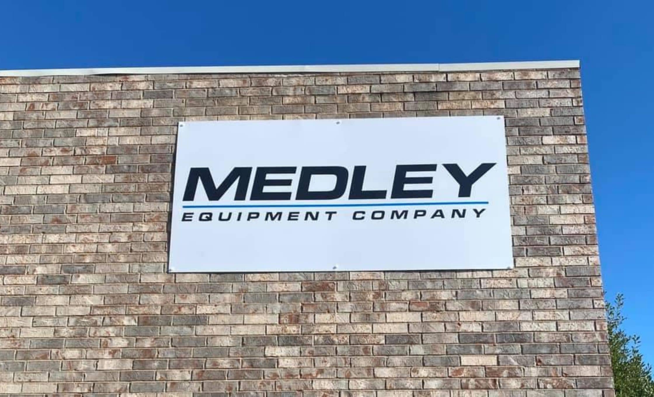
Making Commercial Signs Grab Customer Attention
Investing in quality signage is essential for every brick-and-mortar business.
It lets customers know where you’re located, and gives potential customers and people passing by an idea of who you are and what you do– making them more likely to keep you in mind the next time they’re in need of your products or services.
However, taking a quick drive or stroll through your community will make it clear that business signs are everywhere– and in order to stand out, you have to make a little extra effort.
We’ve compiled some tips to help you invest in the signs that will be most likely to capture customers’ attention, bringing in extra business and increasing brand recognition for your business in your area!
What’s your business all about?
Being able to quickly summarize your business’ main products, services, or mission statement will be a big help in figuring out what information to prioritize on your sign.
You should be able to answer the question: “What am I trying to accomplish with my signage?”
Are you trying to bring in new clients? Establish yourself as a positive presence within your community? Highlight a particular product or service that you’d like to promote?
Having a clear goal in mind will make it much easier to work with your signage professionals to design an effective, attention-grabbing business sign.
Keep it simple
Now that you have a clear goal in mind, you know what information to prioritize on your sign.
It depends on the size and context of your sign, but generally you’ll want to keep the text to a minimum– communicating only the necessary information without any fillers. This will allow customers to quickly scan your sign and get the full picture, rather than skimming over it due to an excess of information or visual clutter.
Have you ever heard the saying “less is more”? This definitely applies to business signage. You don’t need images of all of your products on the sign. In fact, you most likely don’t need images at all, other than your company’s logo.

Consider the context
The design of your business sign greatly depends on the context in which it will “live”.
Is your sign located amongst many other businesses, all vying for customers’ attention? Is it located next to a busy road where cars are passing quickly by?
Check out what other businesses’ signs look like, and consider what’s working and what isn’t. Choose colors that stand out from the crowd while still being true to your established brand design guidelines.
Who’s your audience?
Who is your primary demographic? What kinds of people are purchasing your products or services?
You can do some visual research to figure out what kinds of imagery appeal to your audience most, and then design your business sign accordingly!
Call in the pros
If you’re not a graphic designer and aren’t sure exactly where to start when it comes to sign design, don’t panic– that’s what the design experts here at Wrapology are for!
Just give us a call or reach out for a free quote today to get started.
