Great Design Ideas for Your Business
Signs are absolutely everywhere you go, from billboards in the big city to street signs and handmade produce stand signs in the country– and on the highways in between.
They’re a tried-and-true, necessary method of spreading information to the people who need it; they help people find the products and services they’re looking for, and they help people go from point A to point B as easily and painlessly as possible.
If you’re running a business, creating a visual brand is an essential task that should be one of your first priorities. If you’re an online-only business, you still need to get the word out there, and creating a recognizable brand image for potential customers is necessary.
But for brick-and-mortar businesses, good, recognizable, and clear signage is paramount.
What should my sign look like?
Your business is unique, so your sign should be unique, too!
In order to determine what your sign should look like, you’ll first need to develop a visual brand. It helps to work with a designer for this part of the process if you’re not familiar with it, but you can get a head start on your own.
A visual brand is simply a representation of your business. Consider your product and your target market. Who buys the product? What kind of people would you like to attract?
The signage for a children’s clothing store versus the signage for a skateboard shop should be quite different, for example.
Assemble some imagery you like and think about how it could be used to represent your business. There’s no harm in doing some visual research, too– check out signage you like from other businesses, and even your competitors.
What are they doing that you think works? What are they doing that you don’t like? All of these points can be used to inform your design strategy.
Keep it simple
Visibility is the main purpose of your signage. You want to let people know where you’re located and give them an idea of what you offer.
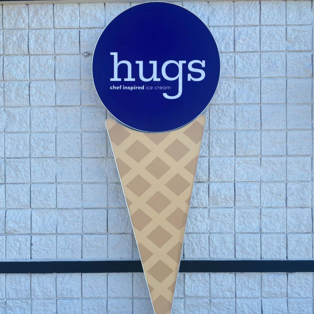
In order to ensure visibility, simplicity is a must. Whether the people who will be passing by your sign every day are driving at highway speeds or walking, a very busy, cluttered sign without enough contrast will most likely be ignored by viewers; if they can’t make out what it’s supposed to represent within a split second, they’re very likely to just pass it by.
Think of the biggest corporations in the world. They’ve created recognizable symbols that let people know within a millisecond, without any conscious thought, that they’ve located the building or the product that they’re searching for.
Some good examples of this: Apple, Target, Coca-Cola, among many others.
There’s no need to create a logo as iconic as the Apple logo, but a simple visual– whether it’s an image or text– will do wonders for the efficacy of your signage.

Size does matter
The biggest brands in the world have mutli-hundred-page branding guides for a reason. These guides often determine guidelines for signage based on details like distance from the nearest road, and even the speed limit on that road.
If the sign is located a good distance away from the road, and the drivers are going fast on that road, a big sign that’s well-lit is a necessity.
On the flip side, if the sign is located in a part of town where people are likely to be passing by on foot, a gigantic, brightly lit sign could be overwhelming and much more expensive than necessary.
How do I figure out what design will work best for my business?
If you’re not sure where to start, you can’t go wrong seeking out the advice of experienced professionals like the experts here at Wrapology. We’ve created and installed signage for plenty of businesses over the years, and we know what works– and what doesn’t.
Contact us for a quote today!
